
Elizabeth Fortescue
Elizabeth Fortescue is the visual arts writer for the Daily Telegraph, Sydney, and Australian correspondent for The Art Newspaper, London
Homepage: http://www.artwriter.com.au
Posts by Elizabeth Fortescue
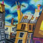


, by Wendy Sharpe")

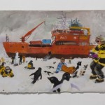
Wendy Sharpe sails to Antarctica with the Mawson Centenary Expedition
Jul 21st


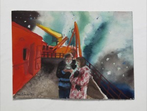
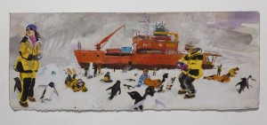
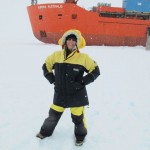
I had a wonderful talk to Wendy Sharpe in her studio this week, about her six weeks on board the Aurora Australis in January-February this year [2012], as an invited artists with the Mawson centenary expedition to Antarctica.
Wendy had been invited by David Jensen, chairman and CEO of the Mawson’s Huts Foundation, to help promote the Foundation’s work in conserving the historic huts and to promote the scientific program being undertaken by the Australian Antarctic Division. The Aurora Australis is the AAD’s research and supply vessel, and on board the ship Wendy had a studio on the bridge which she shared with the AAD’s meteorological officer. It provided a brilliant view of the landscape she was seeing for the first time in her life.
We pored over the myriad works on paper on her studio floor, with Wendy enthusing about the extraordinary landscape she saw, and talking with great animation and affection about the thousands of penguins which inhabit that extraordinarily hostile environment.
Many of the sketches were done panorama-style on fold-out sketchbooks embossed with Wendy’s name in silver on the front. She had the sketchbooks printed especially for the Antarctic voyage, and their covers were a gorgeous sky blue.
Virtually all the work we were looking at had been done in Antarctica, with just a few large oil paintings done later in her studio. This latter category includes the self-portrait which became a finalist in this year’s Archibald Prize, and which is still on tour with the rest of the Archibald exhibition. It also includes the refrigerator which will be sold off to benefit the Mawson’s Huts Foundation, which now carries pictures of penguins and explorers’ huts courtesy of Wendy.


Luckily, given that the southern oceans are some of the most treacherous in the world, Wendy was only seasick for a day. One of her panorama sketches includes her shared cabin, and you can see Wendy’s dark hair on the pillow as she curls up in her bunk with pretty bad mal de mer. Luckily, she soon recovered. A really bad bout of seasickness could have wrecked the journey for her.
“We just lay there all day. It wasn’t that bad,” Wendy said.
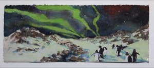
The Adele penguins which are native to the Antarctic feature comically in many of Wendy’s works from the voyage.
“That was one of the most amazing things in my whole life,” she said.
Despite looking like cookie-cutters had created them, the penguins managed to be hilariously individualistic, changing their body shapes to echo their innermost thoughts, be they aggressive or playful or whatever was going through their minds. Wendy never tired of watching the penguins’ antics, and her delight in the knee-high creatures is translated into her sketches and paintings from the trip.
Although humans are not allowed to approach the Adele penguins, Wendy saw how relaxed they were around people, even approaching some members of the Aurora Australis crew and pecking their boots. “They’re not afraid of us, because their only predator is a leopard seal and [the leopard seals are] in the water,” she said.
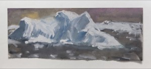
She loved the way the penguins would shoot out of the water head-first, and land on the ice on their feet. She was also seduced by the gorgeous aqua colour of the ice floes just under the surface of the water.
Entering Mawson’s hut, Sharpe was overwhelmed by the sense of history. “They still have some of the things from that original expedition — clothes, candles, paperback novels,” she said.
She ventured into Mawson’s bedroom and expedition photographer Frank Hurley’s darkroom. Many things were intact, although snow drifts covered much of the flooring.
“It’s kind of snap frozen,” she said.
One of the most remarkable moments for Sharpe was a graphic demonstration by scientists of the pressure exerted on objects at pelagic depths. In the experiment, Wendy painted on a six-pack Esky which was then lowered into the ocean to a depth of five kilometres. When the Esky was brought back to the surface, it was intact. But it had shrunk dramatically, and would barely have held one can. “They often do foam cups,” Wendy said. “This was a six-pack Esky.”
Wendy’s exhibition, Wendy’s Sharpe’s Antarctica, is on at the Australian National Maritime Museum at Darling Harbour in Sydney from Monday July 23 to Saturday July 28. All the artworks are for sale.
Elizabeth Fortescue, July 21, 2012

Archibald Prize 2012, or “Smudge Storrier’s big day out”
Apr 27th
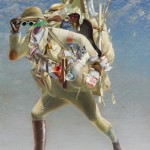
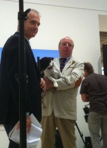
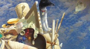
, by Tim Storrier. Photograph courtesy of the Art Gallery of NSW") When Tim Storrier won the Archibald Prize on March 30, 2012, no one expected the occasion at the Art Gallery of NSW to become a doggy day out. But that’s exactly what happened when Storrier’s family cajoled the gallery attendants into giving the family pooch special access. And quite rightly so, because Smudge the rescued fox terrier is literally top dog in Storrier’s winning painting, sitting at the pinnacle of a pile of travelling requisites with which Storrier depicts himself. The painting is titled The Histrionic Wayfarer (after Bosch). The painting is reproduced at left.
When Tim Storrier won the Archibald Prize on March 30, 2012, no one expected the occasion at the Art Gallery of NSW to become a doggy day out. But that’s exactly what happened when Storrier’s family cajoled the gallery attendants into giving the family pooch special access. And quite rightly so, because Smudge the rescued fox terrier is literally top dog in Storrier’s winning painting, sitting at the pinnacle of a pile of travelling requisites with which Storrier depicts himself. The painting is titled The Histrionic Wayfarer (after Bosch). The painting is reproduced at left.
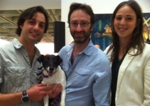
The winning artist is always the centre of attention on Archibald announcement day, but this year Smudge was equally in demand among the assembled media throng. She was photographed and filmed from every possible angle, and took it all in her rather jaunty stride. Used to the peppery smell of fresh oil paint from Storrier’s studio, where she is the artist’s constant companion, Smudge perhaps felt quite at home at the gallery.
Here’s my photographic record of Smudge’s big day out.
Chief of AGNSW trustees Stephen Lowy announces that Storrier has won the prize.

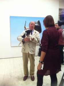
Immediately after the announcement, Smudge appears in Storrier’s arms, having been brought into the gallery by family.

Smudge waits while AGNSW acting director Anne Flanagan says congratulations to Storrier.
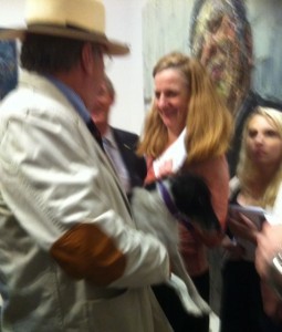
Storrier holds Smudge while being interviewed by Anne Maria Nicholson for the ABC.
Now it’s Scott Bevan from the ABC. Smudge stays put.
Smudge gets put down and is immediately the subject of more video.

Smudge poses for a happy snap with Storrier’s sons and step-daughter.
Here’s a detail of the winning painting, showing Smudge. If you look closely, you can see she is looking at a drawing of Storrier as it flies away in the wind.
And here’s Storrier’s painting from the finals of last year’s Archibald Prize. Titled Moon Boy (self portrait as a young man) it also shows the artist ruminating on the nature of the self, and whether to be invisible is really to be absent. The painting speaks of life and death, of eternity and memory. It’s a wonderful picture. Pity the Art Gallery of NSW isn’t an acquisitive prize. It would be nice to have Storrier’s winning painting in the collection, not to mention many other past winners of the Archibald Prize. Perhaps that’s a thought?
, by Tim Storrier. Picture courtesy Art Gallery of NSW") And finally, here’s a link to the Australian Galleries exhibition in which Storrier showed more portraits in his current series.
And finally, here’s a link to the Australian Galleries exhibition in which Storrier showed more portraits in his current series.
Elizabeth Fortescue, April 27, 2012
William Kentridge talks to Artwriter about his latest Sydney exhibition
Apr 25th
 South African contemporary artist William Kentridge is one of the world’s most extraordinary artists and, in recent years, one of the most celebrated. Kentridge’s work is inventive, poetic, dramatic, reflective, political, sincere and communicative of the human condition.
I interviewed Kentridge on March 9, 2012, when he came to Sydney for the opening of his Annandale Galleries exhibition, William Kentridge: Universal Archive (Parts 7-23).
Kentridge was also in Australia for the opening of his internationally travelling exhibition at the Australian Centre for the Moving Image, in Melbourne. The show, Five Themes, was curated by Mark Rosenthal.
At Annandale Galleries, which has represented Kentridge in Australia for many years, the works included an impressive array of drawings, drawings for films, drypoints, aquatints, linocuts, screenprints, sculptures and even tapestries. These last were done by Kentridge in collaboration with Marguerite Stephens.
I had met Kentridge a few times before, in particular when he exhibited his work on Cockatoo Island in the Biennale of Sydney 2008. So it was delightful to see him again in Sydney, and have the chance to see him adding the final touches to his Annandale Galleries exhibition. As we spoke, Kentridge was interrupted a couple of times by fans. They greeted him like a celebrity, and his response was a polite “thank you” and a willingness to chat about his work.
Here’s my interview with Kentridge, in slightly edited form.
Many of your drawings are done on old ledgers which have been filled with beautiful, copperplate writing. Other works are printed on the pages of dictionaries. Where do you source these materials?
When I travel, one of the things I do is go to second hand bookshops. I know some [people] make sense of a new city by going to the station or by going to a market. For me it has to do with second hand bookshops and finding a text from that city and using that as a basis. In general the books are about having a pre-history on the paper that one is drawing over, rather than a blank sheet of paper. The second thing is the specific reference to where the books are bought.
 So for example the big drawing of the sweet peas [at left]. I was in Rome when I was drawing that, at the American Academy, and found this book which is in fact a sort of history of meetings of the Society of St Frances from the 1780s, I think. But the main point about it is that it has to do with the quality of paper. The subject has to be of some connection, but it usually primarily has to do with the quality of paper and how that will be to draw on. Some paper is very shiny [which makes it easy to erase charcoal]. That paper that the sweet pea drawing is on absorbs the Indian ink very beautifully. It holds the different tones of washes. The encyclopaedia and dictionary pages the linocuts are both on give a uniform size and format to them all, and an extra odd association between the image and the text.
Do you look for particular words in the dictionaries?
I wouldn’t hunt through the different pages. I rely on the chance association of different pages doing different things. On the one hand it’s very similar. All the pages in the dictionary are pretty similar, but each one is unique. The linocut is printed on a disemboweled Shorter Oxford English Dictionary. There are very strange mixes that come on different ones.
What about the old ledgers on which you have drawn?
The old ledgers are interesting, particularly with the Johannesburg drawings, for example a landscape drawing on an old ledger in the corner, they’re ledger books from just after the discovery of gold in Johannesburg in 1886, so just 10 years after that. And so it’s a sense of one history of Johannesburg and a record of it, a different kind of record of Johannesburg in the other drawings done on top of them. But it also has to do with the nature of the handwriting, the extraordinarily optimistic copperplate hand of the bookkeepers in the 1890s, which changes to less confident handwritings as you get through the 20th century.
Does it?
Oh yes, if you look at the handwriting in 1906 versus the handwriting in 1950 of people keeping books, it has to do with the going out of beautiful ox gall black ink to the arrival of ballpoint pens. So there are sets of association with the books that continue through the drawings.
Where do you get the old ledgers?
The big ledgers are from second hand bookshops in Johannesburg. But generally old books like that are of no use. The only people who buy them if they’re not going to draw on them would be interior decorators putting them into accountants’ offices to give a false sense of authority to the offices.
Do they actually do that?
Oh yes, they do. They’re quite expensive because they’re bought for decoration. The really old rare books I’m not interested in drawing on. The books I draw on are all books which are destined just to die of mildew eventually. They’re not rare, and I do have a sense that many of them get looked at for the first time in 150 years when the drawings are on top of them.
 Bill Gregory [owner/director of Annandale Galleries] brought in a bag of books for you today? What are they for?
We needed books to put the sculptures on as a kind of plinth. I had sent some from Johannesburg but we needed some extra ones and chose ones in terms of colour and scale. [One of the books was an old hardback with its title on the spine: Thoracic and Abdominal Viscera.] Quite often I’ll go to a bookshop and they say ‘well what book are you looking for?’, and the description has to be ‘at least shall we say 15cm by 20cm and the subject’s not so vital but I mainly want to feel the pages’. And some bookkeepers look at you and say, ‘oh well, you must be crazy’, and sometimes they say, ‘oh yes, you’re one of those artists that wants to draw on the old books’. They kind of know.
Do you sometimes leaf through a book you’ve bought to draw or print on, and find it’s actually a good book?
Often. There are some books I’ve bought assuming I’m going to draw on them and started paging through them and [I decide] I’ll wait till I’ve read it or I won’t disembowel them. And there are a couple that I have cut up that I regret, not in that I’ve destroyed a rare object, but just that I would come across a page and wish I had the next page, but it disappeared into a drawing three years ago. My shelves are full of half-eaten books.
You plan to go to some second hand bookshops in Sydney. Will you look for a book about Sydney?
Not actually about Sydney, but a book that very much comes from here. So it may be a book about engineering drawings from the 1930s. And Sydney is a city that I know, having been here several times. But I’m sure I will find a couple of books to take back. [His wife is from Sydney. He has nieces and great nieces here.]
The coffee pot is a recurring image in this exhibition.
Sometimes it’s a self portrait as a coffee pot.
Do you like coffee?
I do like coffee, but in fact I don’t like coffee from one of these kinds of coffee pots. It’s too bitter and too thick for me. So in fact I use either an espresso machine or a French press for my coffee. So all the ones which have been given to me or I got from second hand shops over the ages are all sitting in the studio waiting to be drawn or waiting to be made into sculptures. So they do everything except make coffee in the studio.
How did it become a symbol?
There’s a very easy anthropomorphism of it, that they look like people. They’ve got a slight skirt, they’ve got a head, they’ve got an arm on a hip. So they’re both a very recognisable domestic object but they could also be a performer in an opera. They’re very schematic to draw. So in this exhibition there’s a series of about 15 or 16 versions of the coffee pot as a linocut, which range from quite representational drawings of them to something that’s almost like a calligraphic mark.
We could speak about the past, but the big show in Melbourne [Five Themes] is doing that. So what’s on the drawing board at the moment?
I have two projects which are both nearing completion. One I think of as a drawing, but it is in fact a series of six lectures at Harvard which even though they end up as me speaking on a stage, have been constructed kind of like a series of drawings, of notes, of additions, of revisions, of erasures, and there’s a lot of projection and drawn material within, so it’s a fairly static theatrical event that I’ve been preparing. And the other is a much more raucous event for Documenta in Kassel in June, which is many performers and actors and musicians and projections, that’s nearing completion. Called The Refusal of Time.
Time is something that’s cropping up a lot in your work?
In this current body of work it’s a big element, and time has more to do with trying to escape one’s fate than escape time, which we know we can’t do but we act as if we could.
You speak about collaborators. If you can’t make something with cardboard and glue you need a collaborator.
I could make this megaphone out of cardboard, but to turn it into steel there’s someone in the studio. [With] tapestries I can do the collage, but I certainly can’t do the weaving.
Given that, is your studio ever a quiet place?
I have two studios. I have one which is a larger one in town where the sculpture happens, and where noise and grinding happens, and in the other studio when I’m drawing then it’s me on my own. It’s at the house. If I’m doing rehearsals with actors we’ll work in the big studio.
How many people do you employ?
I employ four people in the office, administratively, and there’s one person permanently employed in the other studio helping me make sculptures, engineering, and a large number of people in ancillary studios which are not mine. (tapestry and foundry and print workshop).
Further notes:
The Shorter Oxford English Dictionary pages used by Kentridge included those pages from Pantoscope to paper-stainer, ordinary to organ, out-of-date to outroll, rand to rank, imbecile to immaculate, pagoda-tree to pair, flagrant to flan, phlegmasia to phonetic, peripatus to peritrochium.
The massive tapestry in the exhibition was sold for $200,000 to a private collector. It was by Kentridge and Margeurite Stephens. Title: Tableau des Finances et du Commerce de la partie Francoise de St Domingue.
Kentridge also uses the Encyclopaedia Brittanica and prints linocuts on them.
") The work Sweet Peas, 2011, [detail at left] is in Indian ink on 40 found pages. Each page is numbered.
The work Sweet Peas, 2011, [detail at left] is in Indian ink on 40 found pages. Each page is numbered.
Elizabeth Fortescue