
Archive for April, 2012
Archibald Prize 2012, or “Smudge Storrier’s big day out”
Apr 27th
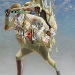
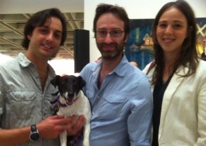
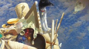
, by Tim Storrier. Photograph courtesy of the Art Gallery of NSW") When Tim Storrier won the Archibald Prize on March 30, 2012, no one expected the occasion at the Art Gallery of NSW to become a doggy day out. But that’s exactly what happened when Storrier’s family cajoled the gallery attendants into giving the family pooch special access. And quite rightly so, because Smudge the rescued fox terrier is literally top dog in Storrier’s winning painting, sitting at the pinnacle of a pile of travelling requisites with which Storrier depicts himself. The painting is titled The Histrionic Wayfarer (after Bosch). The painting is reproduced at left.
When Tim Storrier won the Archibald Prize on March 30, 2012, no one expected the occasion at the Art Gallery of NSW to become a doggy day out. But that’s exactly what happened when Storrier’s family cajoled the gallery attendants into giving the family pooch special access. And quite rightly so, because Smudge the rescued fox terrier is literally top dog in Storrier’s winning painting, sitting at the pinnacle of a pile of travelling requisites with which Storrier depicts himself. The painting is titled The Histrionic Wayfarer (after Bosch). The painting is reproduced at left.
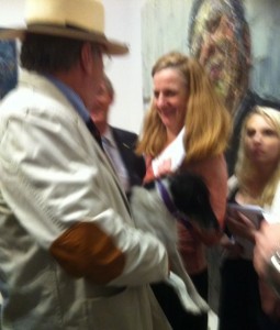
The winning artist is always the centre of attention on Archibald announcement day, but this year Smudge was equally in demand among the assembled media throng. She was photographed and filmed from every possible angle, and took it all in her rather jaunty stride. Used to the peppery smell of fresh oil paint from Storrier’s studio, where she is the artist’s constant companion, Smudge perhaps felt quite at home at the gallery.
Here’s my photographic record of Smudge’s big day out.
Chief of AGNSW trustees Stephen Lowy announces that Storrier has won the prize.

Immediately after the announcement, Smudge appears in Storrier’s arms, having been brought into the gallery by family.

Smudge waits while AGNSW acting director Anne Flanagan says congratulations to Storrier.
Storrier holds Smudge while being interviewed by Anne Maria Nicholson for the ABC.
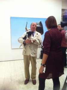
Now it’s Scott Bevan from the ABC. Smudge stays put.
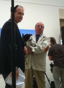
Smudge gets put down and is immediately the subject of more video.

Smudge poses for a happy snap with Storrier’s sons and step-daughter.
Here’s a detail of the winning painting, showing Smudge. If you look closely, you can see she is looking at a drawing of Storrier as it flies away in the wind.
And here’s Storrier’s painting from the finals of last year’s Archibald Prize. Titled Moon Boy (self portrait as a young man) it also shows the artist ruminating on the nature of the self, and whether to be invisible is really to be absent. The painting speaks of life and death, of eternity and memory. It’s a wonderful picture. Pity the Art Gallery of NSW isn’t an acquisitive prize. It would be nice to have Storrier’s winning painting in the collection, not to mention many other past winners of the Archibald Prize. Perhaps that’s a thought?
, by Tim Storrier. Picture courtesy Art Gallery of NSW") And finally, here’s a link to the Australian Galleries exhibition in which Storrier showed more portraits in his current series.
And finally, here’s a link to the Australian Galleries exhibition in which Storrier showed more portraits in his current series.
Elizabeth Fortescue, April 27, 2012
William Kentridge talks to Artwriter about his latest Sydney exhibition
Apr 25th
South African contemporary artist William Kentridge is one of the world’s most extraordinary artists and, in recent years, one of the most celebrated. Kentridge’s work is inventive, poetic, dramatic, reflective, political, sincere and communicative of the human condition.
I interviewed Kentridge on March 9, 2012, when he came to Sydney for the opening of his Annandale Galleries exhibition, William Kentridge: Universal Archive (Parts 7-23).
Kentridge was also in Australia for the opening of his internationally travelling exhibition at the Australian Centre for the Moving Image, in Melbourne. The show, Five Themes, was curated by Mark Rosenthal.
At Annandale Galleries, which has represented Kentridge in Australia for many years, the works included an impressive array of drawings, drawings for films, drypoints, aquatints, linocuts, screenprints, sculptures and even tapestries. These last were done by Kentridge in collaboration with Marguerite Stephens.
I had met Kentridge a few times before, in particular when he exhibited his work on Cockatoo Island in the Biennale of Sydney 2008. So it was delightful to see him again in Sydney, and have the chance to see him adding the final touches to his Annandale Galleries exhibition. As we spoke, Kentridge was interrupted a couple of times by fans. They greeted him like a celebrity, and his response was a polite “thank you” and a willingness to chat about his work.
Here’s my interview with Kentridge, in slightly edited form.
Many of your drawings are done on old ledgers which have been filled with beautiful, copperplate writing. Other works are printed on the pages of dictionaries. Where do you source these materials?
When I travel, one of the things I do is go to second hand bookshops. I know some [people] make sense of a new city by going to the station or by going to a market. For me it has to do with second hand bookshops and finding a text from that city and using that as a basis. In general the books are about having a pre-history on the paper that one is drawing over, rather than a blank sheet of paper. The second thing is the specific reference to where the books are bought.
 So for example the big drawing of the sweet peas [at left]. I was in Rome when I was drawing that, at the American Academy, and found this book which is in fact a sort of history of meetings of the Society of St Frances from the 1780s, I think. But the main point about it is that it has to do with the quality of paper. The subject has to be of some connection, but it usually primarily has to do with the quality of paper and how that will be to draw on. Some paper is very shiny [which makes it easy to erase charcoal]. That paper that the sweet pea drawing is on absorbs the Indian ink very beautifully. It holds the different tones of washes. The encyclopaedia and dictionary pages the linocuts are both on give a uniform size and format to them all, and an extra odd association between the image and the text.
Do you look for particular words in the dictionaries?
I wouldn’t hunt through the different pages. I rely on the chance association of different pages doing different things. On the one hand it’s very similar. All the pages in the dictionary are pretty similar, but each one is unique. The linocut is printed on a disemboweled Shorter Oxford English Dictionary. There are very strange mixes that come on different ones.
What about the old ledgers on which you have drawn?
The old ledgers are interesting, particularly with the Johannesburg drawings, for example a landscape drawing on an old ledger in the corner, they’re ledger books from just after the discovery of gold in Johannesburg in 1886, so just 10 years after that. And so it’s a sense of one history of Johannesburg and a record of it, a different kind of record of Johannesburg in the other drawings done on top of them. But it also has to do with the nature of the handwriting, the extraordinarily optimistic copperplate hand of the bookkeepers in the 1890s, which changes to less confident handwritings as you get through the 20th century.
Does it?
Oh yes, if you look at the handwriting in 1906 versus the handwriting in 1950 of people keeping books, it has to do with the going out of beautiful ox gall black ink to the arrival of ballpoint pens. So there are sets of association with the books that continue through the drawings.
Where do you get the old ledgers?
The big ledgers are from second hand bookshops in Johannesburg. But generally old books like that are of no use. The only people who buy them if they’re not going to draw on them would be interior decorators putting them into accountants’ offices to give a false sense of authority to the offices.
Do they actually do that?
Oh yes, they do. They’re quite expensive because they’re bought for decoration. The really old rare books I’m not interested in drawing on. The books I draw on are all books which are destined just to die of mildew eventually. They’re not rare, and I do have a sense that many of them get looked at for the first time in 150 years when the drawings are on top of them.
 Bill Gregory [owner/director of Annandale Galleries] brought in a bag of books for you today? What are they for?
We needed books to put the sculptures on as a kind of plinth. I had sent some from Johannesburg but we needed some extra ones and chose ones in terms of colour and scale. [One of the books was an old hardback with its title on the spine: Thoracic and Abdominal Viscera.] Quite often I’ll go to a bookshop and they say ‘well what book are you looking for?’, and the description has to be ‘at least shall we say 15cm by 20cm and the subject’s not so vital but I mainly want to feel the pages’. And some bookkeepers look at you and say, ‘oh well, you must be crazy’, and sometimes they say, ‘oh yes, you’re one of those artists that wants to draw on the old books’. They kind of know.
Do you sometimes leaf through a book you’ve bought to draw or print on, and find it’s actually a good book?
Often. There are some books I’ve bought assuming I’m going to draw on them and started paging through them and [I decide] I’ll wait till I’ve read it or I won’t disembowel them. And there are a couple that I have cut up that I regret, not in that I’ve destroyed a rare object, but just that I would come across a page and wish I had the next page, but it disappeared into a drawing three years ago. My shelves are full of half-eaten books.
You plan to go to some second hand bookshops in Sydney. Will you look for a book about Sydney?
Not actually about Sydney, but a book that very much comes from here. So it may be a book about engineering drawings from the 1930s. And Sydney is a city that I know, having been here several times. But I’m sure I will find a couple of books to take back. [His wife is from Sydney. He has nieces and great nieces here.]
The coffee pot is a recurring image in this exhibition.
Sometimes it’s a self portrait as a coffee pot.
Do you like coffee?
I do like coffee, but in fact I don’t like coffee from one of these kinds of coffee pots. It’s too bitter and too thick for me. So in fact I use either an espresso machine or a French press for my coffee. So all the ones which have been given to me or I got from second hand shops over the ages are all sitting in the studio waiting to be drawn or waiting to be made into sculptures. So they do everything except make coffee in the studio.
How did it become a symbol?
There’s a very easy anthropomorphism of it, that they look like people. They’ve got a slight skirt, they’ve got a head, they’ve got an arm on a hip. So they’re both a very recognisable domestic object but they could also be a performer in an opera. They’re very schematic to draw. So in this exhibition there’s a series of about 15 or 16 versions of the coffee pot as a linocut, which range from quite representational drawings of them to something that’s almost like a calligraphic mark.
We could speak about the past, but the big show in Melbourne [Five Themes] is doing that. So what’s on the drawing board at the moment?
I have two projects which are both nearing completion. One I think of as a drawing, but it is in fact a series of six lectures at Harvard which even though they end up as me speaking on a stage, have been constructed kind of like a series of drawings, of notes, of additions, of revisions, of erasures, and there’s a lot of projection and drawn material within, so it’s a fairly static theatrical event that I’ve been preparing. And the other is a much more raucous event for Documenta in Kassel in June, which is many performers and actors and musicians and projections, that’s nearing completion. Called The Refusal of Time.
Time is something that’s cropping up a lot in your work?
In this current body of work it’s a big element, and time has more to do with trying to escape one’s fate than escape time, which we know we can’t do but we act as if we could.
You speak about collaborators. If you can’t make something with cardboard and glue you need a collaborator.
I could make this megaphone out of cardboard, but to turn it into steel there’s someone in the studio. [With] tapestries I can do the collage, but I certainly can’t do the weaving.
Given that, is your studio ever a quiet place?
I have two studios. I have one which is a larger one in town where the sculpture happens, and where noise and grinding happens, and in the other studio when I’m drawing then it’s me on my own. It’s at the house. If I’m doing rehearsals with actors we’ll work in the big studio.
How many people do you employ?
I employ four people in the office, administratively, and there’s one person permanently employed in the other studio helping me make sculptures, engineering, and a large number of people in ancillary studios which are not mine. (tapestry and foundry and print workshop).
Further notes:
The Shorter Oxford English Dictionary pages used by Kentridge included those pages from Pantoscope to paper-stainer, ordinary to organ, out-of-date to outroll, rand to rank, imbecile to immaculate, pagoda-tree to pair, flagrant to flan, phlegmasia to phonetic, peripatus to peritrochium.
The massive tapestry in the exhibition was sold for $200,000 to a private collector. It was by Kentridge and Margeurite Stephens. Title: Tableau des Finances et du Commerce de la partie Francoise de St Domingue.
Kentridge also uses the Encyclopaedia Brittanica and prints linocuts on them.
") The work Sweet Peas, 2011, [detail at left] is in Indian ink on 40 found pages. Each page is numbered.
The work Sweet Peas, 2011, [detail at left] is in Indian ink on 40 found pages. Each page is numbered.
Elizabeth Fortescue
Shaun Gladwell: Midnight Traceur and other recent works
Apr 1st
 I interviewed Shaun Gladwell at Anna Schwartz Gallery in CarriageWorks on October 25, 2011, during the installation of his exhibition, Riding with Death: Redux. Here’s the text of our interview.
Gladwell, who has moved to London to live, talked about his parkour video titled Midnight Traceur.
This is the one that features this parkour artist, Ali Kadhim. He’s an amazing performer. He’s the star of the show really. He is unbelievable. It starts off in the day, sort of late afternoon, then it moves into these sequences within Sydney at night, so he’s doing these highly athletic performances in various (locations). [The video is slowed to about 40 per cent of real time.] He’s just so incredibly athletic that every single move is just wild. But this is maybe a different experiment to other parkour videos which are usually very fast and furious. But to slow it down, of course I’m interested in the grace, and all of the detail, and also it’s like a structural film so in every scene it flips between a steady cam which is close and chases him, and a wide shot which includes the method in which he was recorded. It flips between the two for the whole video. You always see the performer and this choreography that takes place between the performer and the camera person, and the next scene is the removed view, the wider view.
Shaun spoke about the part of the video where Ali Kadhim interacts with water features.
Yeah, this is when it gets raunchy when he goes and he deals with water. There’s a whole section of the video where he’s sort of dealing with these water features in the city, so it’s really quite a beautiful series of sequences. That’s actually in Darling Harbour. We’re just playing with it in a different way. The work [Midnight Traceur] features as a secret parkour tour of sydney, which I like. So the work really does track this single parkour free-runner — they call them free-runners or traceurs — through his favourite spots in Sydney.
Parkour reminds me of the movements cats make.
It’s interesting you make that reference to cats because Ali is probably the best known parkour free-runner in Australia, and they have crews like break dancers and his is called Nine Lives which I think is appropriate because I think he’s probably already spent eight doing this. But they love the cat aesthetic and one of the moves is called a cat jump.
 It’s like urban ballet.
It is, it’s a good way to describe it. There’s an incredible amount of skill involved. And it’s interesting because it in a way redesigns space through performance. I always see it as like these other urban activities I’m interested in, where there’s a function that was intended for that space, where that architect or civil engineer or landscape gardener had a particular purpose in mind and there’s this other purpose that gets attached to it, kind of like a para-function, and this is what I’m interested in, this idea that they’re bringing their own interpretation of use to the space.
Shaun stopped to speak about a particular part in the video.
This is actually not parkour. Ali is involved in break dancing and martial arts as well. And he’s incredibly good at parkour and break dancing and martial arts. So these are actually break dancing moves. And this is actually a capoeira move. So it’s almost like he’s involved in all these different styles. The thing that I love about his practice of parkour is that it’s not just pure parkour, whatever pure parkour is. He’s the multidisciplinary parkour free-runner, and there are not too many around.
That’s a wild move. Basically just playing with the city. But I do love the idea that he educates younger practitioners, and they do have this history that’s borrowed from break dancing which is this idea of battling where they have rival gangs but it’s actually not fighting, it’s just testing each other’s skills. So instead of gang-related violence, they’re actually dancing with each other.
Shaun spoke about the exibition in general, which included other works.
There’s quite a lot of disorientation going on in the show. Like the body is involved in a kind of manipulation of gravity and space. [In the video titled I also live at one infinite loop] the figure is in a military aircraft and what’s taking place is it’s an aerobatic experiment. It’s actually myself in this jet fighter with this acrobatic pilot and the guy’s like a military pilot so he has this aircraft that’s capable of doing these incredible things, so as you can see the horizon starts to kind of warp and the idea of wherever north is or the sky starts to become a little bit confused.
In this work I really love the idea that the military technology is being played with somehow. It’s not being used for its intended application, which is horrific. It’s being used as a kind of play thing, or a toy. And also the cameras are fairly dysfunctional when they’re looking at each other like that. They’re recording a landscape and a figure within a landscape, but the feedback loop is in a way a distortion of the camera’s function. You can’t even control it, and the camera was never designed to go into feedback. It was always designed to just shoot a picture plane in front of it. So there were several little plays going on.
Where did you shoot the video, I also live at one infinite loop?
This one was in Australia. I did get the idea in Afghanistan [where Shaun was sent as an official Australian war artist], working with these sort of planes. But for security reasons they couldn’t [do it there]. The areas they were flying over were pretty sensitive.
This was in the Hunter Valley. We wanted a pretty green, lush landscape, but I didn’t really see the landscape because it was just kind of scrolling around underneath me and I didn’t even know which way was up. That’s the plane kind of just doing a total loop. My hand’s going to start to shake when it comes down because the gravity forces are increased. I actually asked the pilot if he could try and knock me out. We were doing this without a gravity suit which forces the blood out of your limbs. I was feeling really light-headed. I think we got up to about 5.
Were you worried about nausea?
I’m OK with that. I like throwing my body around. I made sure I didn’t have a big lunch before this took place. But the pilot is incredible. This is his office. I think it’s bizarre that he’s training himself to undergo these pressures, try to work out where the hell he is in relation to the horizon line. I like the idea that it’s quite a slow video in many respects, and there’s no editing. It’s a single, attenuated, protracted take. All the imagery around this kind of stuff we probably know from Hollywood, this Top Gun style, and the editing is fast and furious and macho and again like the parkour work there’s something really graceful about this activity.
What type of aircraft was it?
It was an L39. They all have these codenames, and that’s known as the Albatros.
Tell us about your work titled Erased Hirst, a skateboard that originally had a Damien Hirst spot painting on it.
It was a limited edition skateboard that Damien Hirst did through this company called Supreme. They deal with artist’s editions. The company asked Damien to do this skateboard, which was great; I think it was fantastic that he did it. But what I was interested in was the fact that usually skateboard graphics are erased through the act of skateboarding. I thought it would be great to erase a Damien Hirst board by the deck being used rather than being like a limited edition artwork. It almost reclaimed the board’s function, but it did connect with this moment that Rauschenberg looked at De Kooning. It’s this kind of conceptual gesture.
Did you feel you were paying homage to Hirst?
Yeah, definitely. There is this interesting relationship between the artist who is erasing and the artworks being erased. They think that for Rauschenberg to say he was paying homage to De Kooning, it’s kind of a double-edged statement. I can imagine he’s identifying De Kooning’s work because he loves it. He would have to care about it enough to want to erase it. But it’s probably closer to the oedipal complex where he’s identifying the authority of this more senior artist who was at that time King of the Kids. Once Pollock dies, De Kooning is right there in terms of abstract expressionism. Even though Jackson probably had the prime spot in terms of obliterating subject matter, De Kooning had so much presence, and Rauschenberg would have been this younger artist with a really radical relationship to the abstract expressionists.
Did you tell Hirst you were going to do it?
No, this was a really removed process. The Rauschenberg story is that he goes to the studio and asks William if he can erase one of his works. If you look closely [at Erased Hirst] you can see the dots. They’re just in the background.
Did you ride it yourself to get rid of the dots?
Oh yeah, that was part of the fun.
In London?
Yeah, and in Sydney as well. It took me a while to get all the dots off. It’s a bit of an effort. I had to really go for it. It’s similar to the Rauschenberg erasing De Kooning. You can still see a ghost image. There’s still an indelible trace, even to the point where it’s the pressure of the pencil or the mark was kind of indented into the paper for De Kooning.
Elizabeth Fortescue, January 26, 2012
Unveiled: Biennale of Sydney 2012
Apr 1st
 Today [February 29, 2012] I attended the official unveiling of the program for the Biennale of Sydney 2012 at the Art Gallery of NSW. It left me with the feeling that this could be a Biennale that speaks softly. It won’t yell or have a tantrum. It won’t try to attract your attention with empty provocation.
The two artistic directors are Gerald McMaster and Catherine de Zegher. McMaster spoke at length about the artists and about the Biennale theme, which is All Our Relations. His collaborator de Zegher was attending to a family matter in Belgium.
So here are the bare facts as outlined by McMaster:
* More than 100 artists from around the world will exhibit
* The main venues will be the Art Gallery of NSW, the Museum of Contemporary Art, Pier 2/3 at Walsh Bay, and Cockatoo Island in Sydney Harbour
* CarriageWorks will be a “presenting partner”, hosting the premiere of some new dance works
Gerald McMaster said the works to be on show would “delight our senses”, rather than being “critical”.
“Throughout the Biennale, audiences should begin to empathise in various ways where they will engage,” he said. “These engagements will move us much closer to bringing about change in our world, in much more concrete ways, where we begin to understand that indeed we are all connected. For some of you who do know this phrase [All Our Relations] it’s been inspired by a number of indigenous peoples around the world who at the beginning of their invocation usually say ‘to all our relations’. Basically it talks about how we are interconnected. So, inspired by this, we titled the exhibition. Throughout the life of the exhibition we hope that audiences will make such connections… and ultimately be much more aware of our interconnections and what this world is about.”
Works mentioned by McMaster at the press conference included:
City of Ghost, by Nipan Oranniwesner, from Thailand : “A composite aerial view of different international cities. It’s laid out on the gallery floor, and there are composite cut-outs and the artist takes baby powder and gently lays it over the top. This idea almost suggests the way that cities have achieved an unidentifiable sameness. Fortunately Sydney still has its own distinct identity.”
Do you remember when? by Postcommodity: “a work that was previously shown in Arizona. Connecting the earth and sky in an axis mundi. It will cut a hole in the gallery floor. I think it is a first since the beginning the building. Normally architects do that. In this case the artists will be doing that. We will be exposing the earth beneath the floor.” This will happen in Yiribana, downstairs in the AGNSW. “Postcommodity describes this hole, this portal as the point of transformation between worlds from which emerges two different discourses, … a relationship between indigenous and western world views, and a discussion about sustainability”.
Park Young-Suk and Yeesukyung: “Youngsuk is one of Korea’s national treasures who has devoted her entire career to perfecting the classic moon jar. They are particularly challenging to make, with the upper torso usually much fuller than the lower half, and the rim is usually wider than the base, making it extremely vulnerable to collapsing in the kiln. So from time to time she will see what she calls obvious failures. Yeesukyung’s work … takes pottery shards and recombines them into some very interesting forms, almost Baroque-like sculptures. The moon jar project brings the two artists together.” A film which documents the collaboration will also be played.
Nyapanyapa Yunupingu: “She will do a light series called Light Paintings. She took 110 drawings she did on acetate using a light pen and these clear acetates have been used as a slow dissolve. She is one of seven indigenous Australian artists in the exhibition. [There are 19 Australian artists in total in the Biennale].
Pinaree Sanpitak: Anything Can Break. “One of Thailand’s few internationally recognised female artists. Made up of hundreds of Origami cubes and glass clouds suspended from the ceiling, illuminated with fibre optics. They are lined with motion censors. They will trigger music and response to the audience’s movements.
Tiffany Singh, Knock on the sky listen to the sound: “It’s from a Buddhist proverb she heard while travelling into the Himalayas in her pilgrimage to a Tibetan monastery.” Wind chimes are meant to be good luck. Audiences will take the wind chimes from the space, take them home, perhaps decorate them, then be asked to bring them to Cockatoo Island where they will be displayed in some of the island’s trees.
Khadija Baker: On the ferry to Cockatoo Island, the 15 minute ride will be enlivened by performative pieces by the artist Khadija Baker, a Kurd by birth who lives in Montreal. People pick up one of her very long plaits and listen to a story of her commnity back in the Kurd region. “In doing so, in listening – as we’re hoping with many works in the Biennale – you begin to empathise with the artist, in this case almost becoming one wth the other as we now engage with her and actually listen to a strand of her hair.”
As you are nearing Cockatoo Island, you may be able to see fog emanating from it. “This is the work of Fujiko Nakaya [her work was installed 1978 at the NGA and she was in the 1976 Sydney Biennale. Her sculpture will cascade down from the top of a hill into the chasm between the rock and the turbine hall.]
In the dog-leg tunnel will be a work by Dutch artist Damien Roosegaarde. “Roosegaarde is one of the leading interactive landscape artists today. By touching, by singing, by dancing, the piece Dune will interact with you. It will play with you. Find an opportunity to get along and see what it does.”
Jonathon Jones presents a midden made from oyster shells and English teacups. Also his fluorescent tubes, which is inspired by his pet eels. “He has a large aquarium and every day he delights in their actions. And so he was inspired to do this piece.”
McMaster concluded by saying All Our Relations is “a direct response to the state of the world”.
“Please take the time to understand how the artists make us understand and be aware of our emotional responses, how they provoke us to ask new questions, and how they make us see the world around us much differently,” he said.
Elizabeth Fortescue, April 1, 2012